Karolina Hodurek
Usługi
Z entuzjazmem rozwijam swoją wiedzę i doświadczenie w mojej dziedzinie. W trakcie kariery zdobyłem różnorodne umiejętności, które nadal doskonalę.
The existing support system was outdated, hard to understand, and especially frustrating for newly onboarded consultants. Customers and partners often bypassed the system entirely, choosing to report issues via direct emails, which led to scattered communication and poor tracking of support requests.
Goals
To build a clear and easy-to-use support system that:
Encourages clients and partners to submit tickets through the platform
Helps consultants manage and resolve cases more effectively
Reduces onboarding time for new team members Increases transparency and consistency in support communication
Design process
Define and Ideate
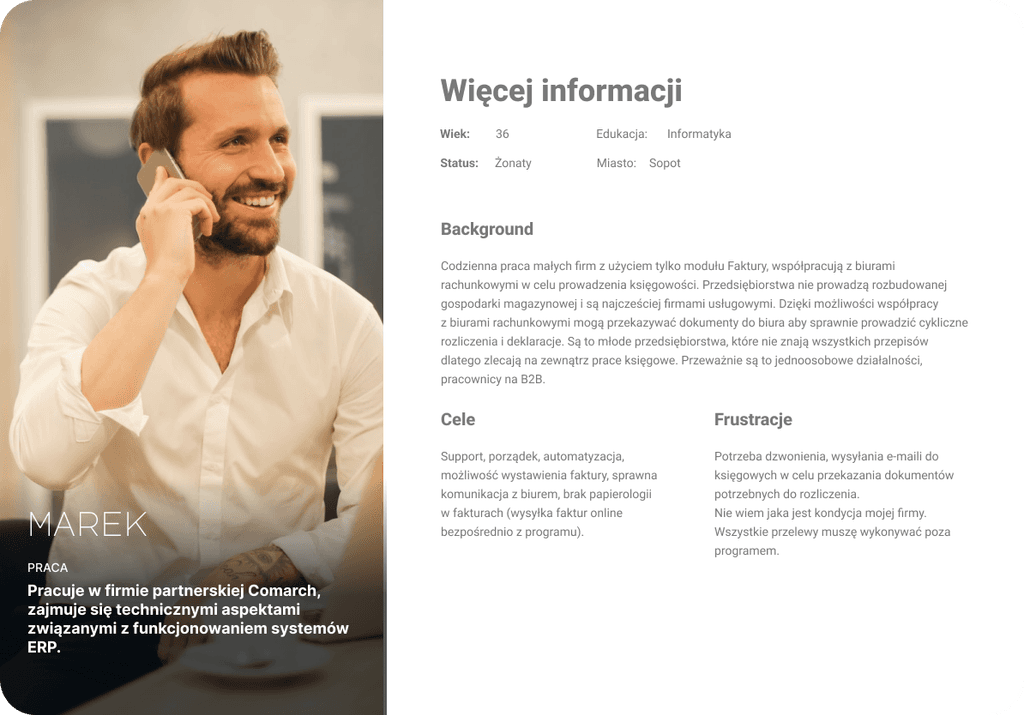
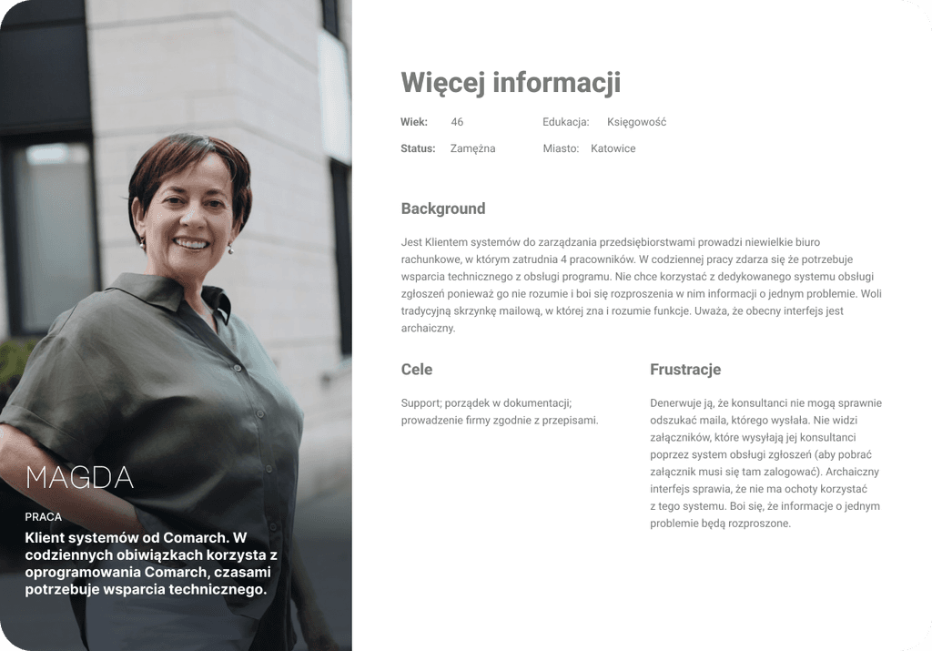
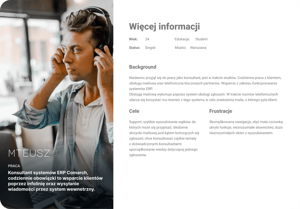
Using research findings, a wide range of ideas and concepts are generated. Key activities include creating personas, mapping user journeys, and prioritizing solutions based on user and business value.
Discovery and Research
In-depth interviews with 8 consultants, 2 partners, and 3 clients
Analysis of the current system and the pain points raised in user feedback
Competitive research into how other platforms handle support workflows
Through these interviews, we learned:
Consultants found the system cluttered and unintuitive
Clients were confused by complex forms and unclear statuses
Partners avoided the system due to lack of guidance and slow responses
Users wanted faster communication, transparency, and better structure
Design is not just what it looks like and feels like. Design is how it works.
Steve Jobs
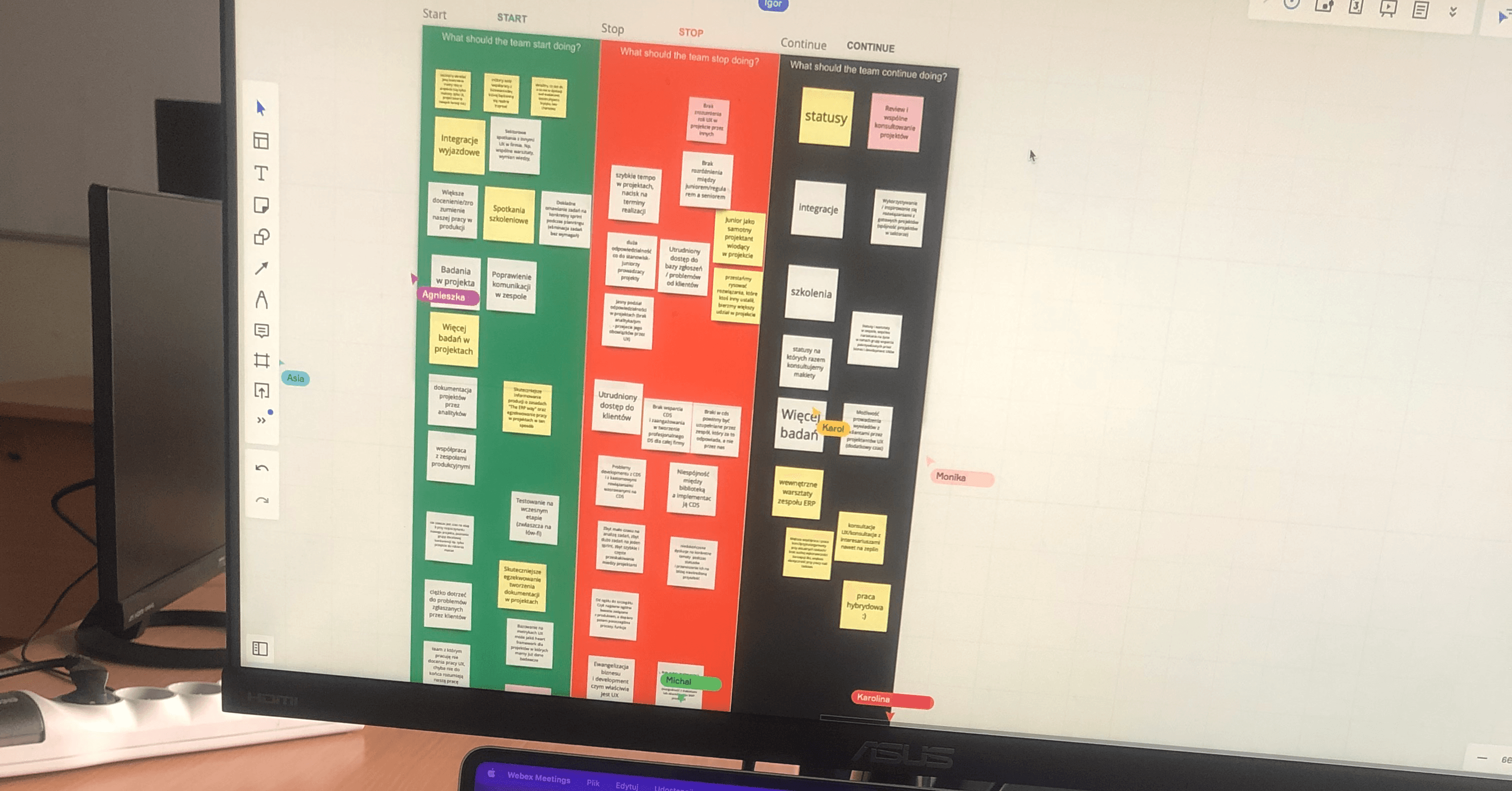
Define and Ideate
We synthesized our findings using
Personas representing consultants, partners, and clients with different levels of system experience
User flows mapping ticket creation, updates, and resolution paths
Information architecture restructuring how tickets are categorized and displayed
Design priorities
Simplify ticket submission and clearly show required fields
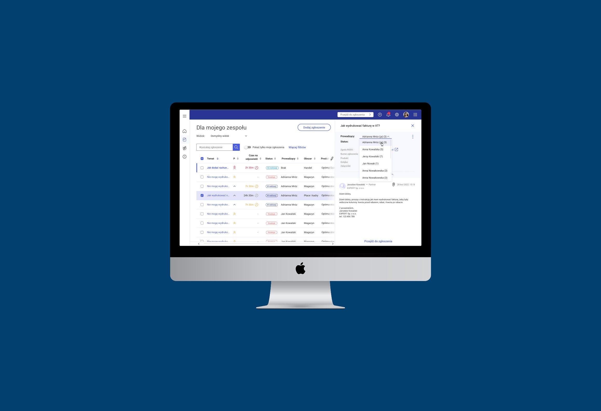
Design intuitive ticket lists with helpful filters and status tags
Improve readability and tracking for both users and consultants
Ensure clear feedback after submission and throughout resolution
Testing and prototyping
Who?
We created interactive prototypes and tested them with consultants and selected clients.
Key feedback and resulting changes
Users appreciated fewer fields and clear labels
Consultants wanted quicker access to case details — we optimized the list for faster scanning
Several users noted confusion around ticket statuses — we added a simple status explanation system
Post-test improvements
We iterated on layouts and wording based on this feedback, ensuring usability across different user groups.
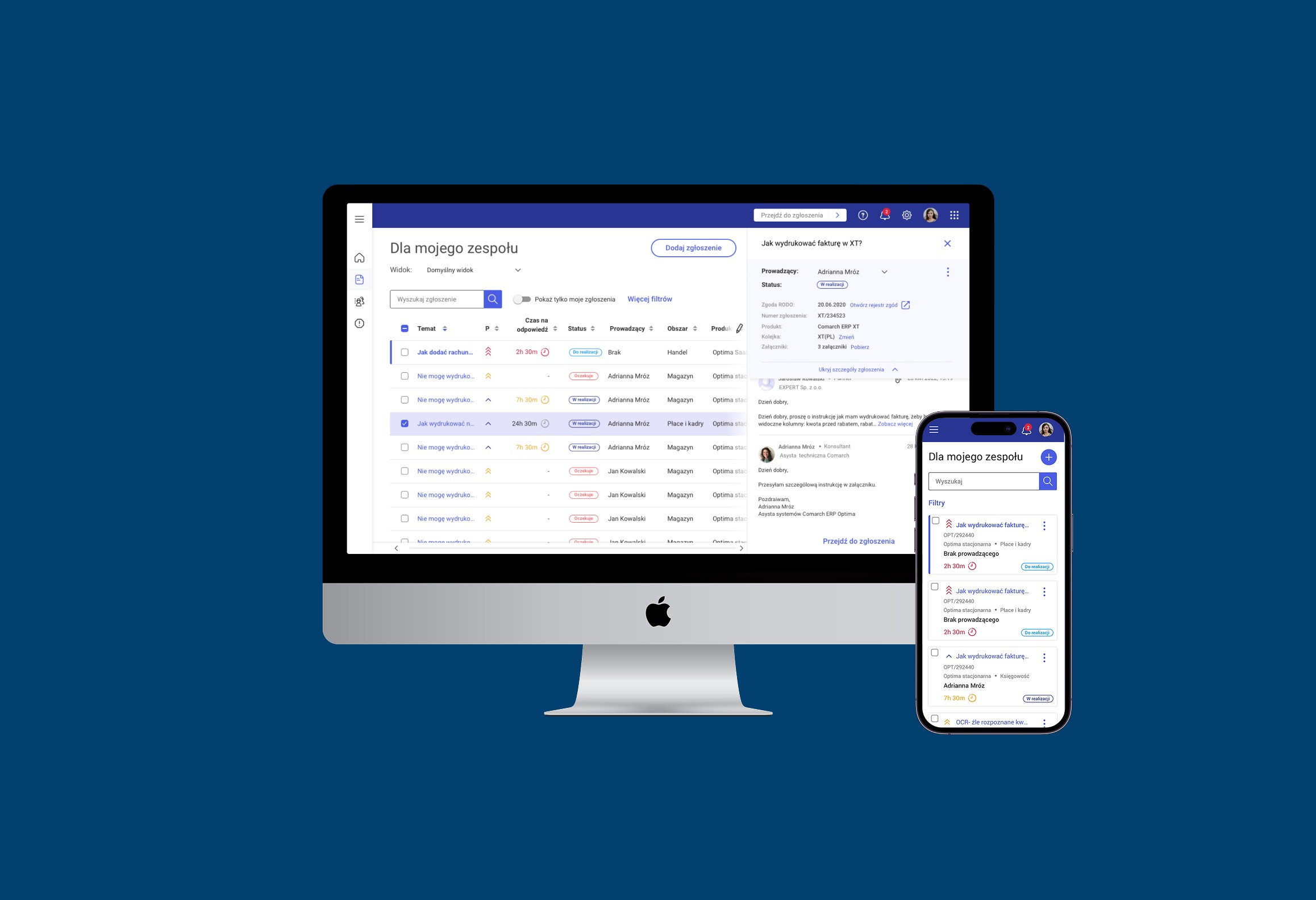
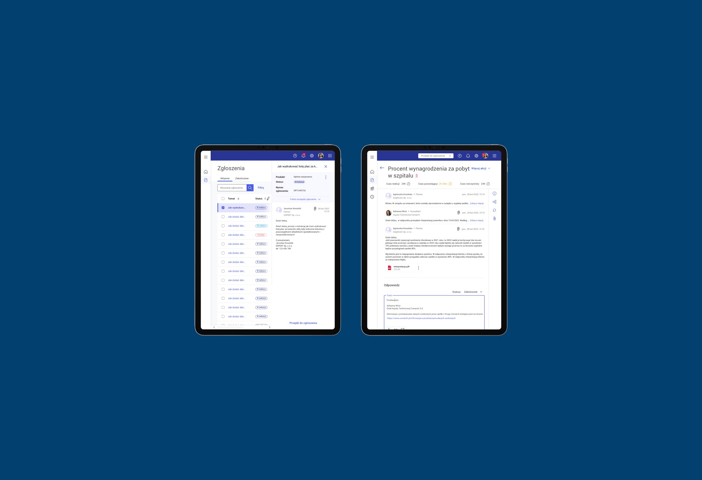
Final solutions
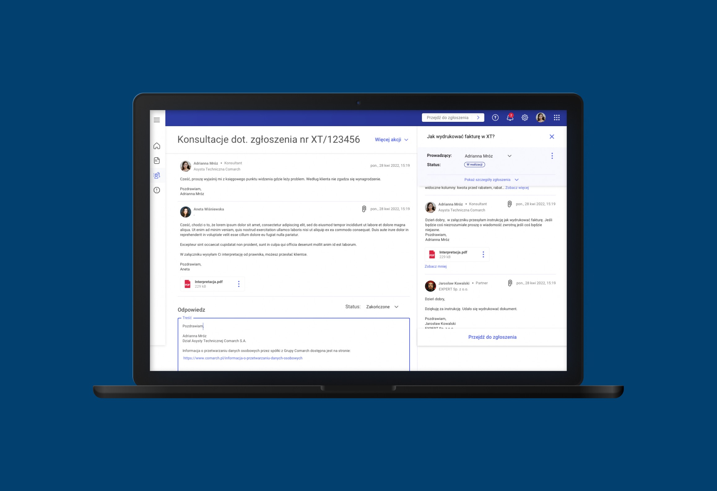
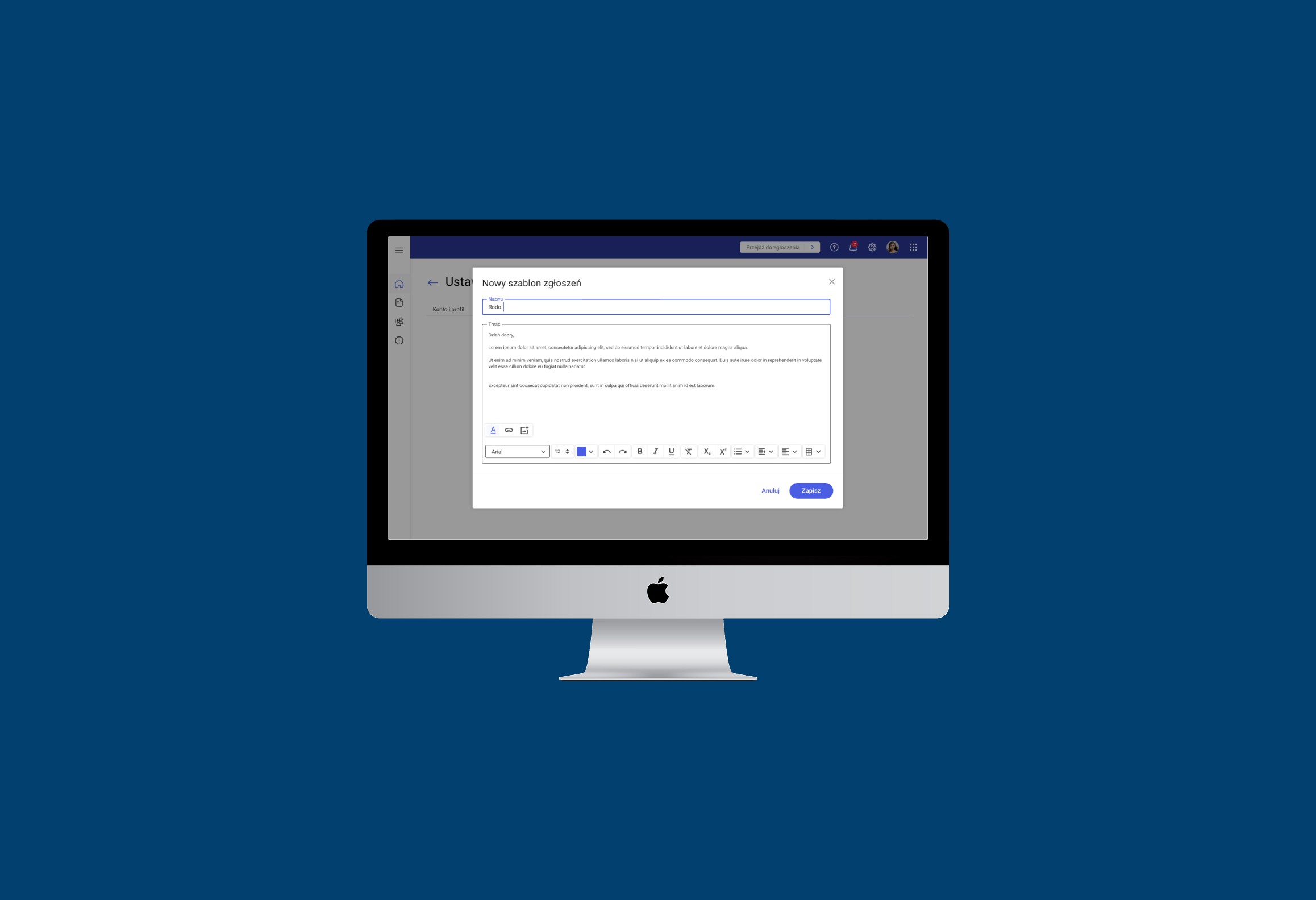
I led the design of the ticket list and submission form interfaces.
Key decisions included:
Using clean, accessible layouts with progressive disclosure (showing only necessary info first)
Highlighting ticket status and priority through visual indicators
Auto-saving drafts and pre-filling user data where possible
Making forms mobile-friendly and easy to use even for first-time users
The design also included contextual help and clearer language, removing jargon and improving overall guidance.
Outcome
Higher adoption among clients and partners — email-based submissions dropped
Faster onboarding of new consultants, who could learn the system within days
Clearer workflows and fewer support errors thanks to improved structure and tracking
Increased satisfaction among all user groups due to a smoother, more intuitive experience
What I learned
This project reinforced the value of listening closely to diverse users — consultants, partners, and clients all had unique frustrations that shaped our solution.
It also highlighted how small changes in structure and language can have a big impact on usability.
Finally, it showed me the importance of designing with scalability and clarity in mind, especially for systems that handle critical, everyday communication.