Karolina Hodurek | Product Designer
The Procurement platform supports sourcing and purchasing activities across a large catalog of products. Over time, users and administrators faced growing challenges with inefficient product search, lack of visibility for preferred products, outdated interface, and limited backend capabilities for catalog management. I led the redesign of the web experience to optimize search and discovery, introduce "Preferred Products" modernize the UI, and propose backend improvements to enable faster catalog setup for new clients.
Company:
Medius
My Role:
Product Designer
Year:
2024
Service Provided:
Discovery and research, UX/UI Design, prototyping
Problems and Goals
Key challenges identified
Users struggled to quickly find the right products due to poor search structure and confusing filtering options.
Preferred products were not easily accessible, complicating the buying process.
Free Text Form items were difficult to locate, often leading to user frustration.
The platform’s web interface was outdated, not aligned with modern UX standards.
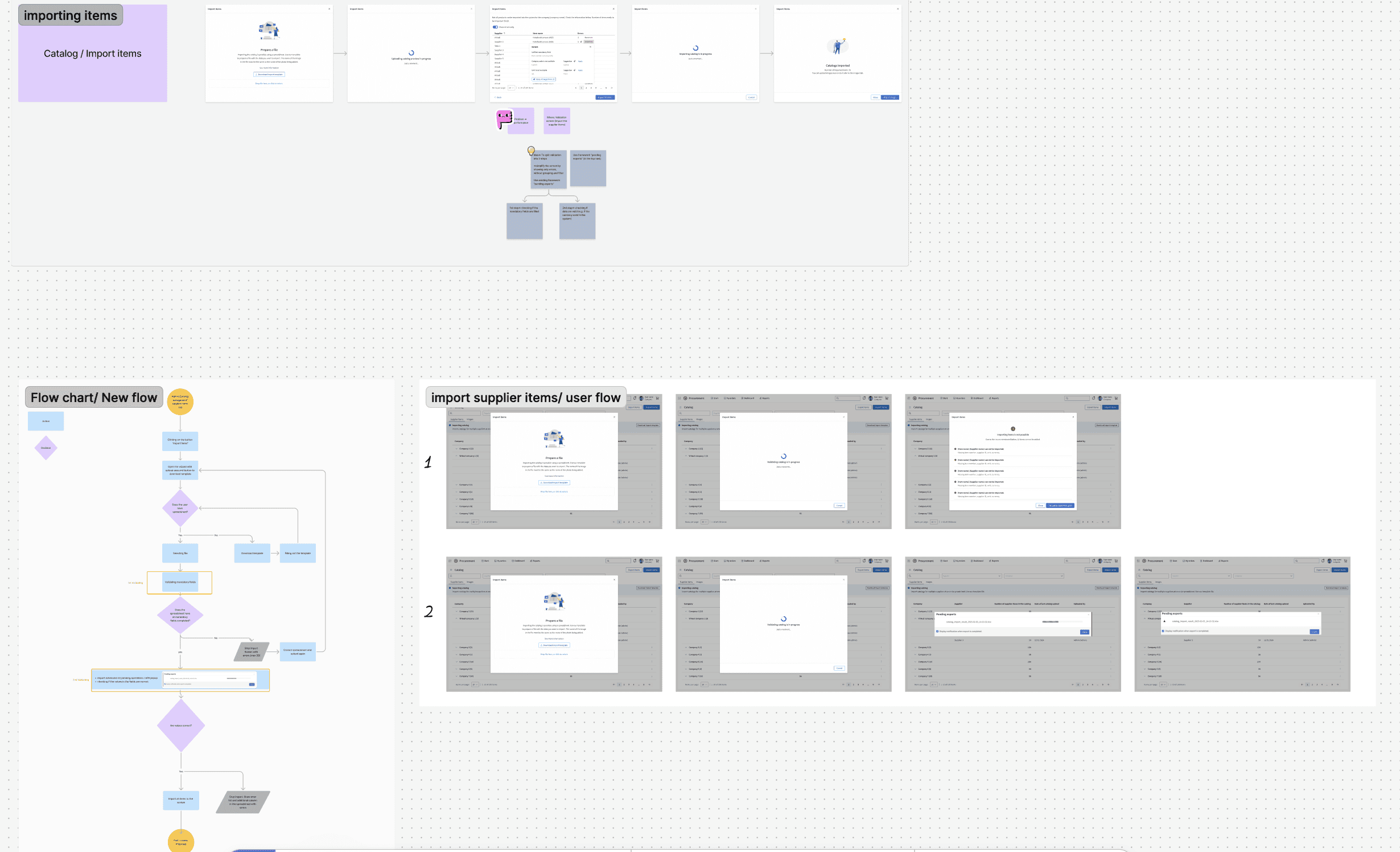
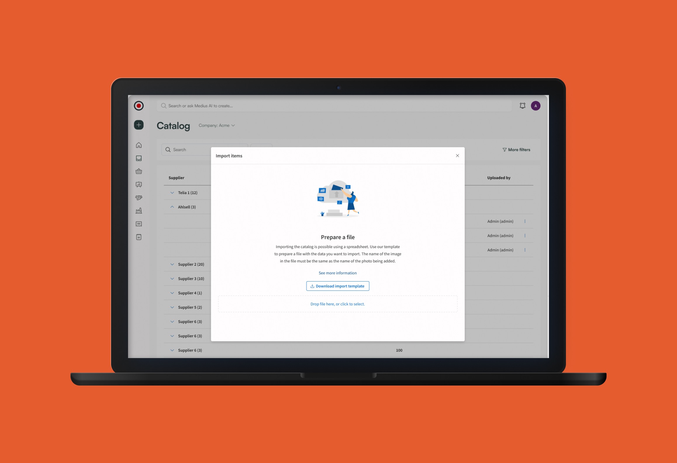
Administrators faced difficulty configuring new catalogs for new clients, with no efficient way to upload or manage large volumes of products.
There was no catalog import functionality, leading to manual and time-consuming product entry processes.
Goals
Simplify and speed up product search and selection.
Introduce a clear Preferred Products section for easier access to frequently purchased items.
Improve visibility and searchability of Free Text Form products.
Modernize the UI for better usability and engagement.
Enable scalable catalog setup through bulk import functionalities and more efficient management tools.

Design process
Discovery
Research and Discovery:
Users feedback, stakeholder workshops, and analytics review to identify user and admin pain points.
Heuristic evaluation of the existing platform.
Competitive benchmarking
Key Findings:
Users reported difficulty locating products efficiently.
Admins spent hours manually creating catalogs for new clients, resulting in delays and frustration.
Lack of import functionality severely limited scalability.
Outdated design created cognitive friction and reduced user trust.
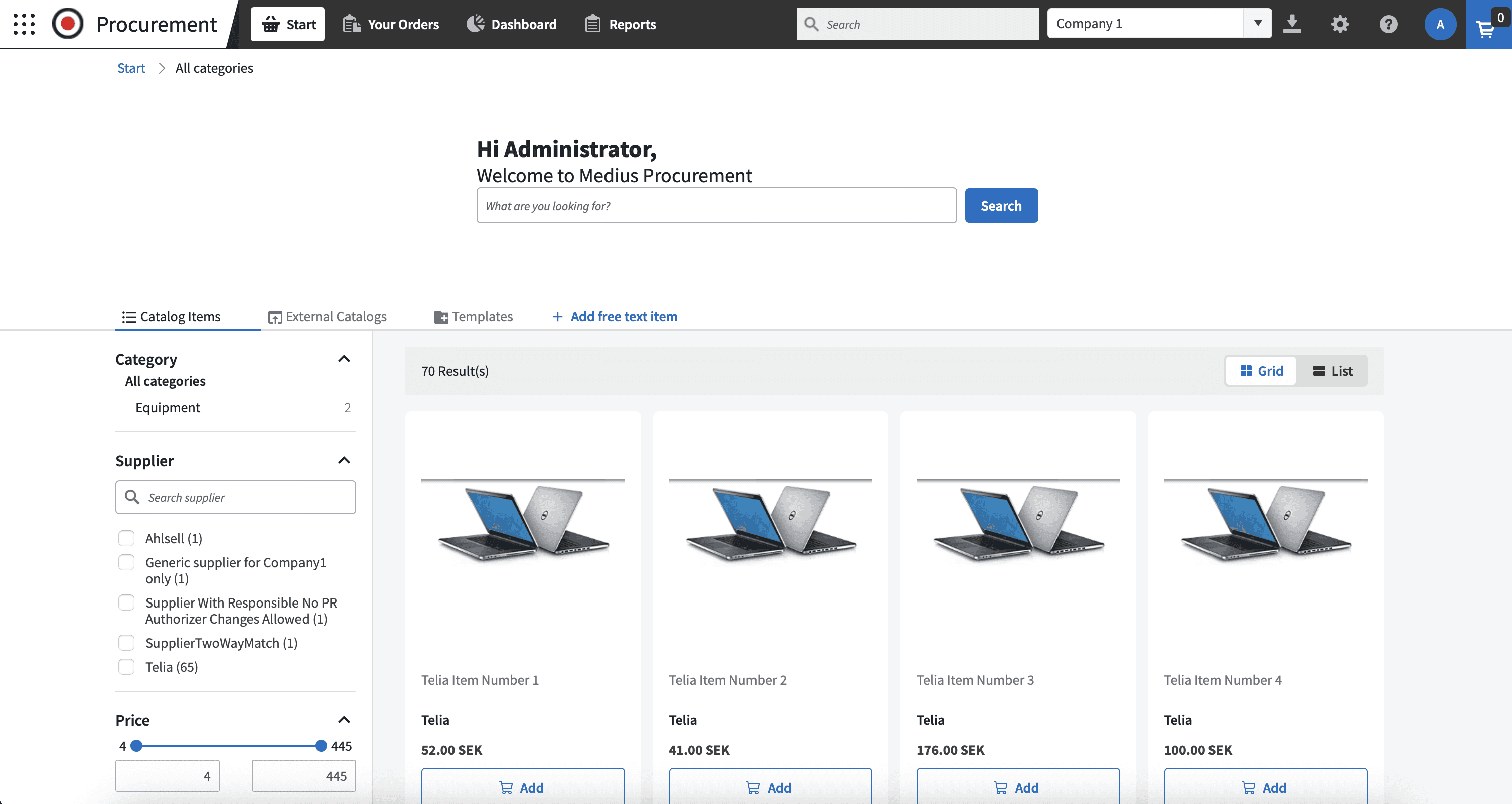
Old interface
Heuristic evaluation revealed major usability issues:
Unclear navigation
Inconsistent UI patterns
Poor user feedback
Lack of accessibility
Not responsive across devices
Outdated visual design
These findings directly informed the redesign strategy.
Final solution
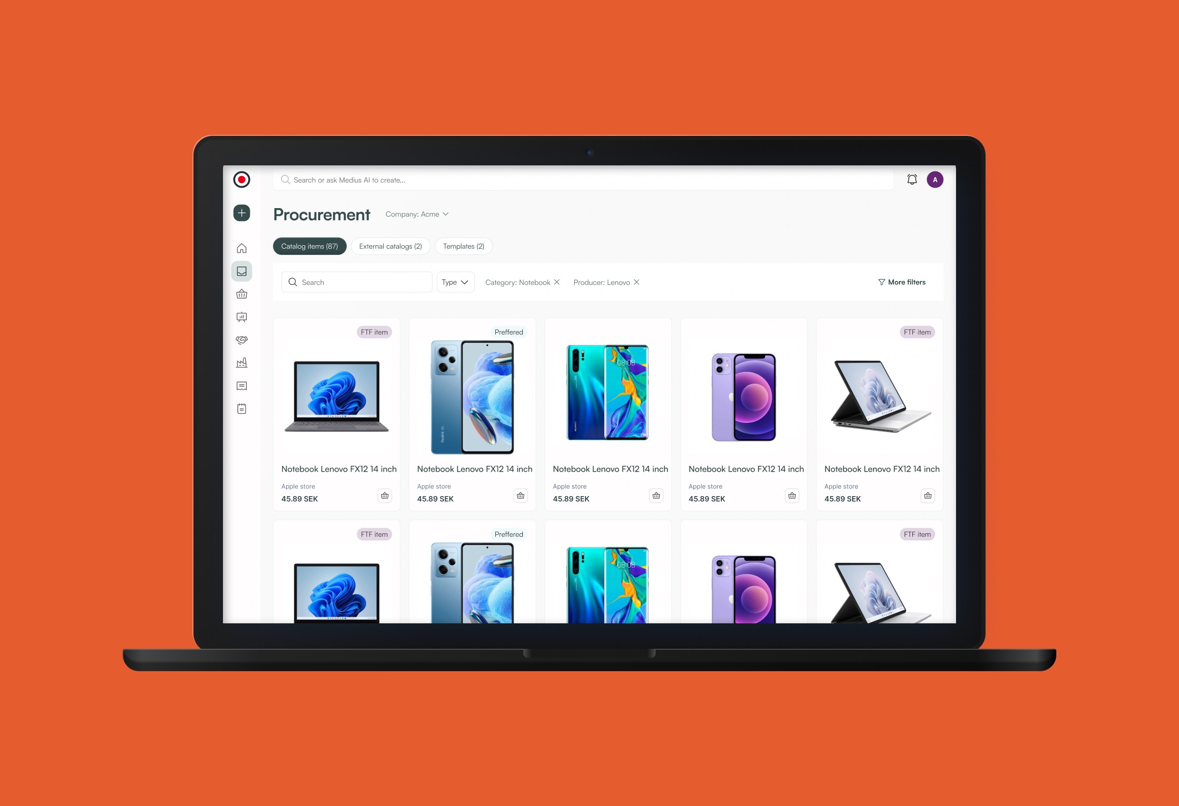
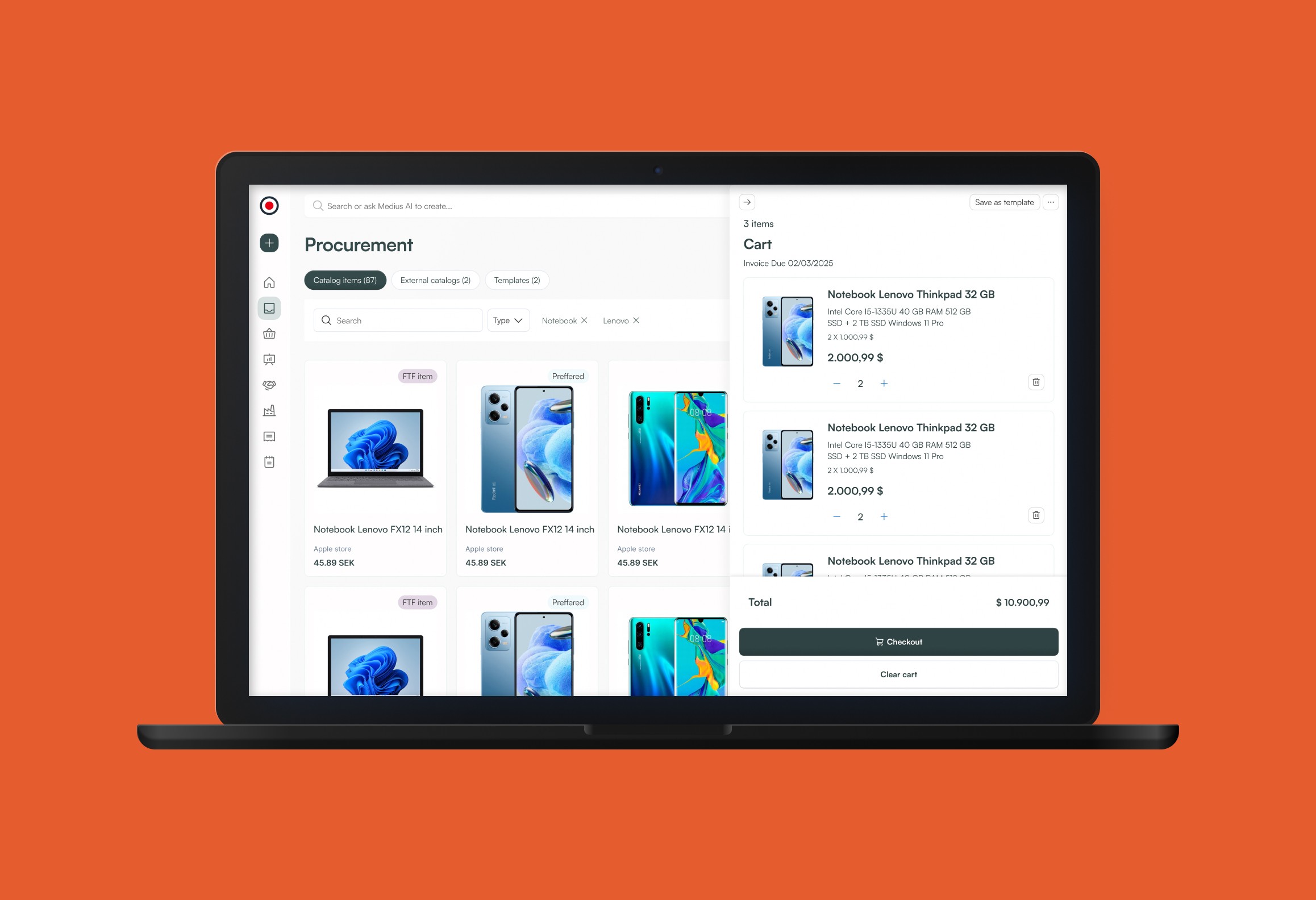
Intuitive and streamlined navigation
The redesigned platform introduced a more intuitive and streamlined navigation structure, allowing users to move through the interface with greater ease. The search functionality was reworked from the ground up — filters were reorganized, categories made more logical, and predictive suggestions added to support faster, more accurate product discovery.
Preferred Products
Section was implemented, positioned for maximum visibility within the browsing and search experience. This allowed users to quickly access frequently ordered items without having to navigate deep into the catalog each time, significantly improving efficiency and satisfaction for repeat buyers.
Scalable concept for catalog management
Specifically the ability to import large product lists during client onboarding. This conceptual direction addressed a major operational pain point for administrators and laid the groundwork for future platform growth and automation.
The Free Text Form
The Free Text Form was redesigned with clearer field instructions and improved placement within the catalog. This was crucial for users who rely on it as their primary way of ordering, making the process faster, more intuitive.
Outcome
Less support tickets
Less support tickets related to product search and catalog issues.
Reduced catalog setup time
Significantly reduced catalog setup time for new users, with positive feedback from the team supporting the onboarding process.
Positive user feedback
Positive feedback from end-users and administrators for improved usability and clarity.
What I learned
This project reminded me how important it is to validate assumptions early — many users relied heavily on the Free Text Form, which we initially saw as secondary. I learned that even small usability improvements can have a big impact when they’re rooted in real user needs. If I were to do this project again, I’d involve end users earlier in the process, especially during initial discovery, to uncover hidden pain points sooner. I also gained confidence working on complex redesigns and balancing user goals with technical and business constraints.