Karolina Hodurek | Product Designer

I worked as a UX Designer on a redesign of a web-based accounting system used by small business owners issuing a few invoices monthly. The goal was to simplify complex processes and modernize the UI to improve usability and trust.
Company:
Comarch
My Role:
UX/UI Designer
Year:
2023
Service Provided:
Discovery and research, UX/UI Design, prototyping
Problems and Goals
Problems
The original system was not meeting user expectations. Users—mostly owners of micro and small businesses—issued only a few invoices per month but were overwhelmed by the interface and terminology. The platform was built around internal accounting logic rather than user needs, which made adoption difficult.
Goals
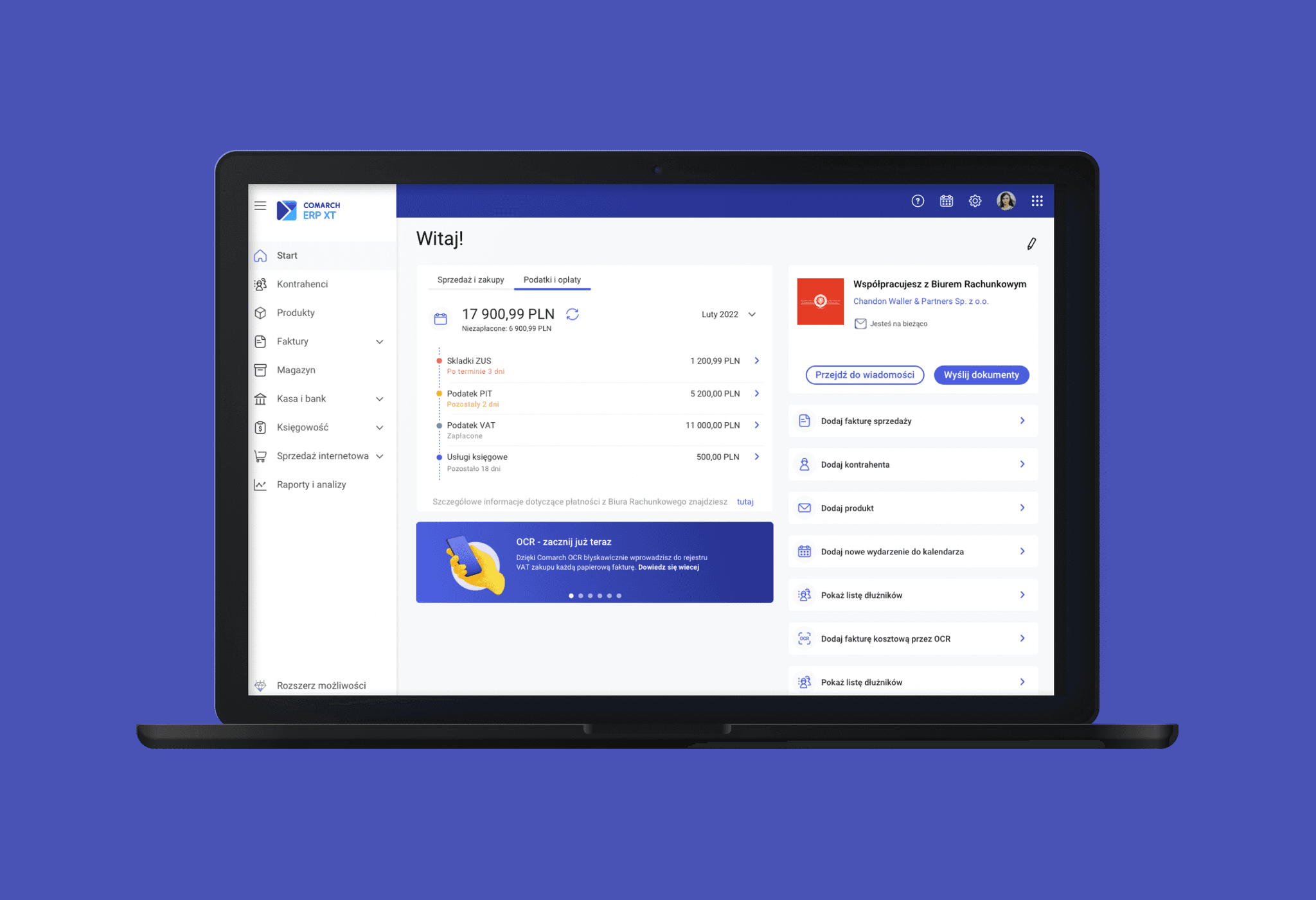
To create a modern, intuitive platform tailored to small business owners with minimal accounting knowledge
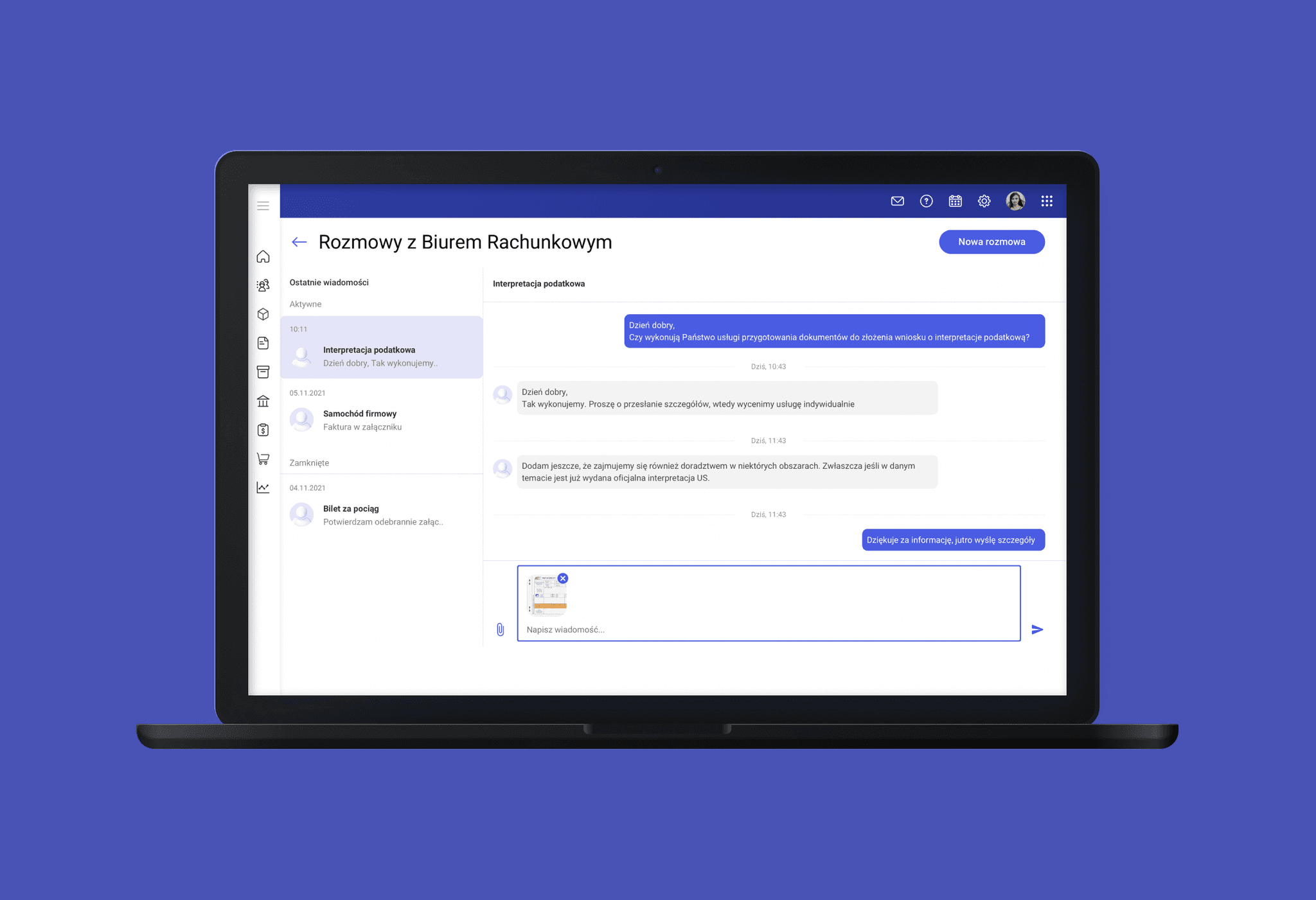
To simplify workflows like document management and communication with accounting offices
To ensure UI consistency with other company products and current design standar
My design process
Discovery and research
I participated in reviewing existing user research, analytics, and customer support feedback. We conducted a competitor analysis to identify best practices in usability and visual design across similar tools. A key finding was that users often didn’t understand the names of modules and actions, and were confused by multi-step workflows that could be simplified.
Together with the product team, we created user personas representing different user types (e.g. tech-savvy entrepreneurs vs. traditional business owners), which helped in identifying priorities for simplification and communication.
Define & Ideate
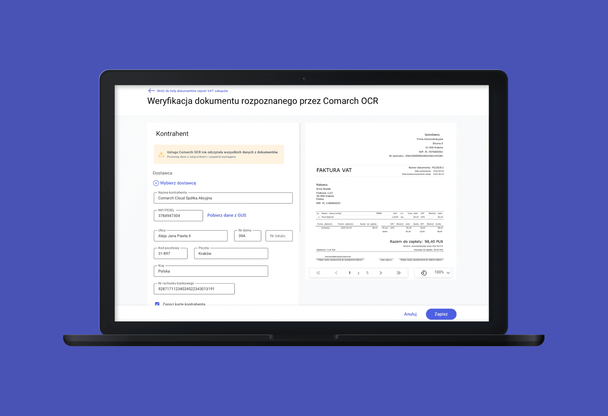
Using insights from the research, we defined problem areas and restructured key workflows. In collaboration with the product team and developers, I contributed ideas to reduce friction in the "Cash & Bank" and "Accounting" modules. I focused on:
Improving the structure and readability of financial forms
Reducing the number of clicks in common workflows
Replacing unclear icons with meaningful text labels
Adding contextual tooltips to explain unfamiliar concepts
UI design
Concepts are translated into user-friendly interfaces, starting with low-fidelity wireframes and progressing to detailed, high-fidelity designs. Attention is given to functionality, accessibility, and visual consistency.
Testing and prototyping
Prototypes are tested with users, and feedback-driven iterations are made to refine the product. Collaboration with developers ensures a smooth implementation, followed by post-launch analysis to drive further improvements.
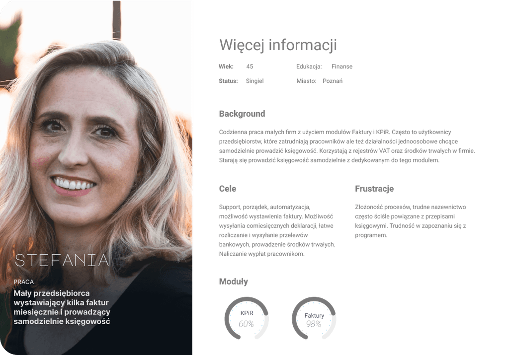
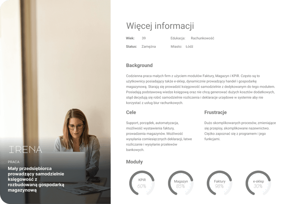
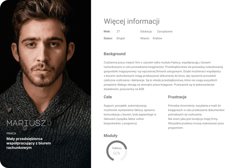
Personas
To ensure user-centric design, we developed detailed personas representing our target audience—small business owners who typically issue a few invoices each month. These personas helped us empathize with users and keep their needs at the forefront of our design process. Key characteristics included their desire for simplicity, efficiency, and support in managing tax-related tasks.
Ideation
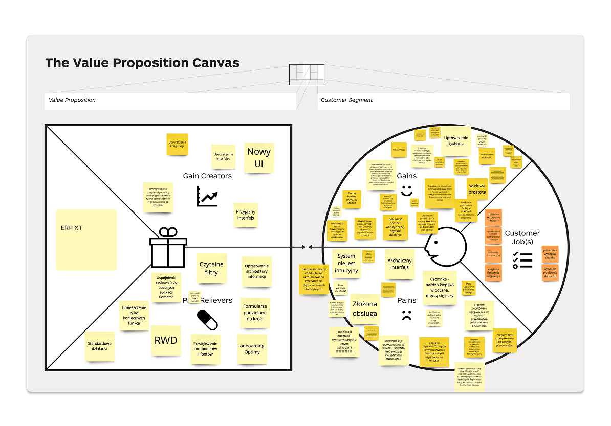
We utilized the Value Proposition Canvas to align our understanding of user needs with the business goals. This tool allowed us to pinpoint the value we were offering to users, such as ease of use, time-saving features, and improved communication with accounting services.
Testing and prototyping
Who?
Usability tests were conducted with 24 users from different groups: internal consultants, clients using various modules, and external partners. Testing covered navigation, terminology, and form usage.
How?
Remote sessions using screen-sharing tools
In-person tests with interactive prototypes
Key findings
Confusion over accounting jargon and labels
Overly compact forms created cognitive overload
Common tasks like importing bank statements were too long
Post-test improvements
Simplified steps in workflows (e.g. fewer clicks to retrieve bank data)
Adjusted layout and spacing in key forms
Clarified labels and added supportive text
Replaced ambiguous icons with descriptive buttons
The only way to find out what people really need is to observe them using your product.
Don Norman
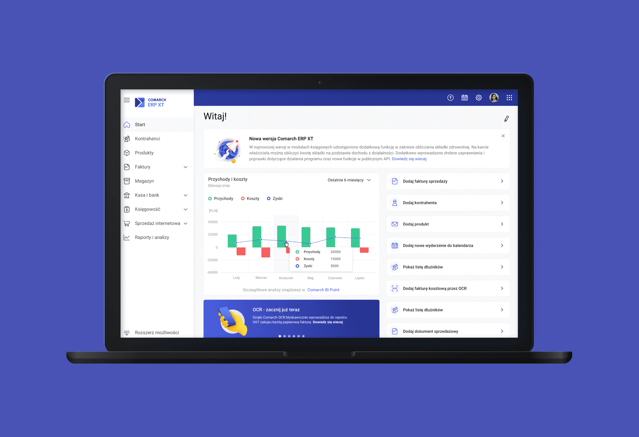
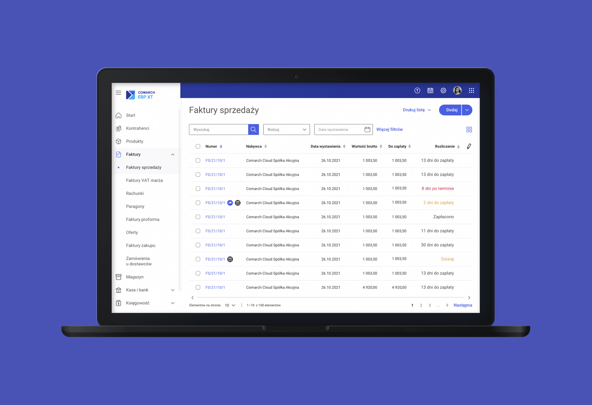
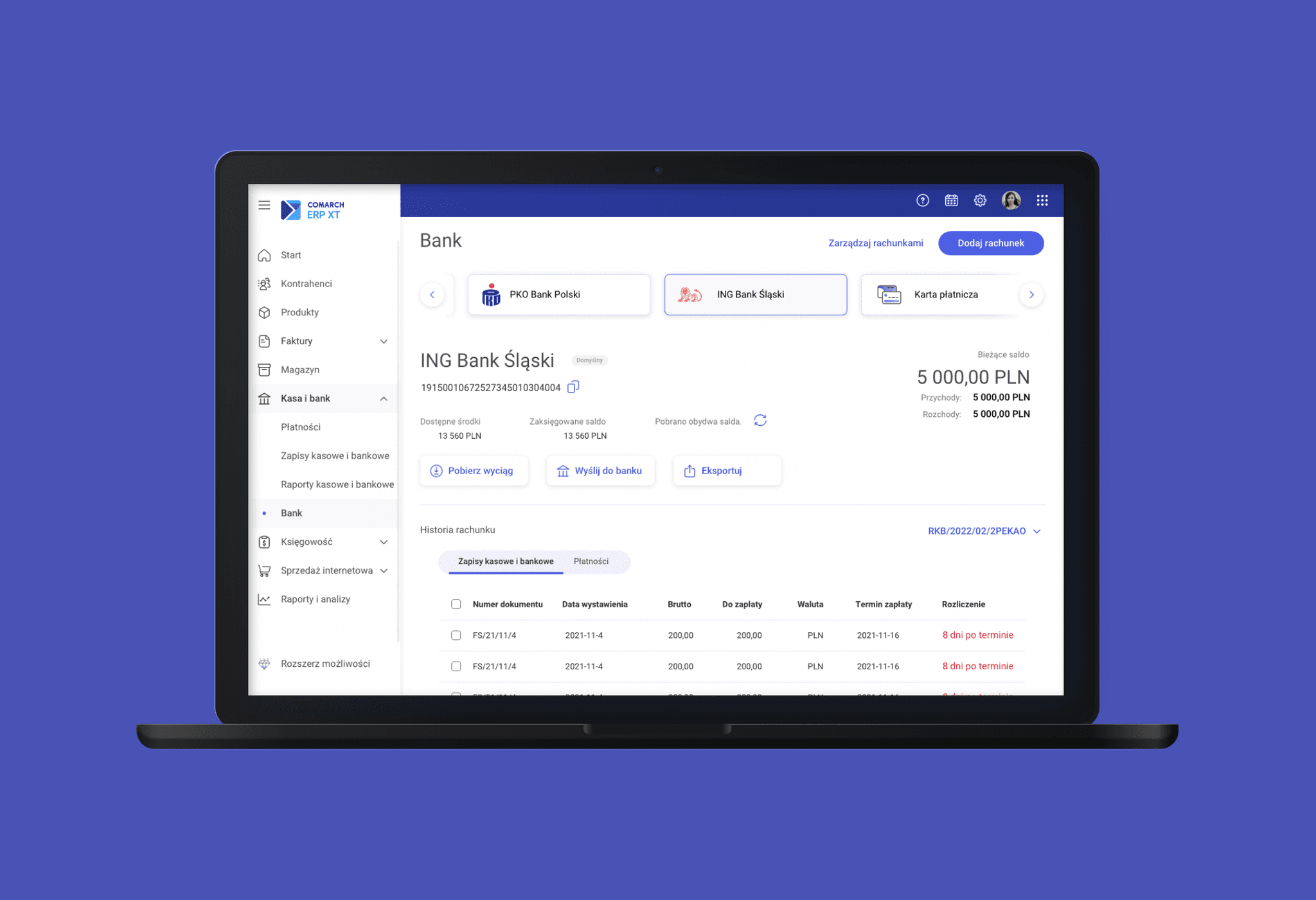
Final solution
Simplified form structure
reworked long, dense forms into clearer, more digestible sections with logical grouping of fields, making them easier to scan and complete.
Improved readability
I used more whitespace, consistent typography, and visual hierarchy to reduce cognitive load and support better focus on essential information.
Language clarity
Replaced accounting-specific jargon with simple, plain language that small business owners could easily understand, without needing professional knowledge.
Design system consistency
All components followed the company's shared UI guidelines to ensure visual consistency across products, reduce development complexity, and speed up implementation.
Outcome
The redesigned modules significantly improved usability and reduced confusion for non-expert users
Users completed key tasks (like retrieving bank statements) faster and with fewer errors
Beta testers gave positive feedback on the clarity of language and layout
Support requests related to navigation and terminology decreased
The new design was consistent with other company products and strengthened product trust
What I learned
This project taught me how important it is to use clear language and keep things simple—especially for non-expert users. I also saw how valuable it is to test ideas early and often. Even small changes, like renaming a button or adjusting spacing, can make a big difference in how people use a product.